
Prints are beautiful, full of life, and capable of instantly adding personality to a home. However, when it comes to longevity in interior design, they are not the main character — the color palette is.
+ 19 hardy indoor plants that don’t mind cold drafts in winter
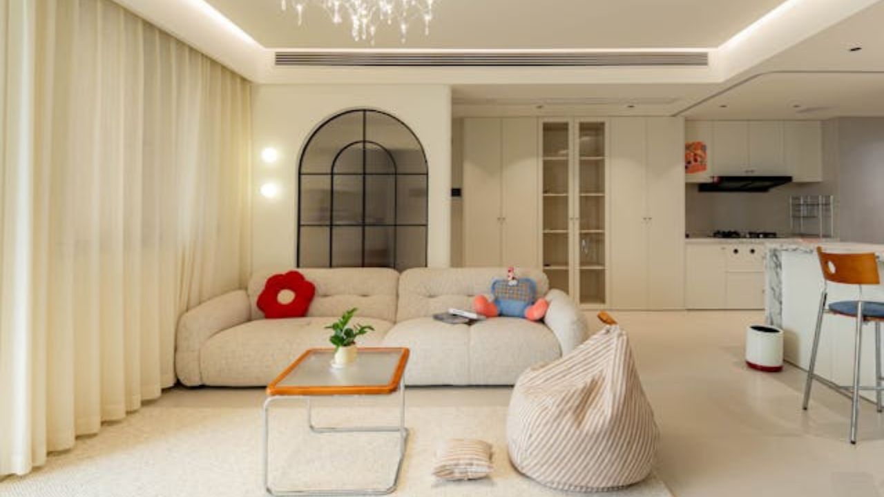
According to an article published by Homes & Gardens, building a truly timeless home begins with the careful selection of tones, textures, and materials that withstand the test of time with elegance.
This is not about demonizing prints. When used in moderation, they create striking visual moments, add narrative, and can even be the unexpected charm of a space. But design meant to last must go beyond instant impact: it requires tonal coherence, visual softness, and continuity between spaces.
Palette, not print: the secret to longevity
As Homes & Gardens explains, classic materials — such as linen, oak, and stone — provide the perfect neutral base for balanced color compositions. They age well, don’t overwhelm the eye, and allow colors to take on a subtle leading role, creating harmony from one room to the next.
This does not mean monotony, but continuity. A well-structured palette offers what the publication describes as “visual rest”: the sense that the eye moves throughout the home without abrupt interruptions, jarring transitions, or competing information.
When color organizes, print shines
Homes & Gardens reinforces that prints are not forbidden — they just shouldn’t take control of the project. Persian rugs, specific wallpaper styles, wood grain patterns, marble with strong veining, and powder rooms can all incorporate prints naturally. But they work best when the tonal base is calm and architecturally coherent.
A home that communicates chromatic sobriety gives prints the space to become points of interest rather than visual noise.
The influence of Italian aesthetics
The timelessness highlighted in the article draws inspiration from classic Florentine interiors: combinations of soft tones, natural textures, and materials that guide the narrative without excess. Italian aesthetics do not rely on trends — they breathe lightness, balance, and visual reliability.
Less trend, more permanence
According to Homes & Gardens, trend-driven prints can become dated quickly. Refined palettes, on the other hand, remain current even as furniture changes, families evolve, or the home undergoes aesthetic updates.
When we define a consistent color base, we create not just a visual project but an emotional experience: a home that welcomes, soothes, and reflects its inhabitants year after year.
In summary: it’s not about abandoning prints, but about giving them the ideal backdrop to exist. The palette organizes, softens, and immortalizes; the print can then shine with the subtlety a truly timeless home deserves.
Source: Homes & Gardens
This content was created with the help of AI and reviewed by the editorial team.
