
If you’re struggling to choose tones for your color palette, you’re in the right place! We’ll help you eliminate any uncertainty about picking a color scheme.
If you spend hours browsing interior photos, it’s time to consider the foolproof 60-30-10 rule. Discover how to use this design formula to give your home a harmonious look. From wall art to furniture, here’s how to apply the 60-30-10 rule.
Color wheel in interior design
Before we explain the 60-30-10 rule, think about the colors you want to include in your palette. A simple way to choose the ideal scheme is by consulting the classic color wheel. Complementary colors sit opposite each other and are great for adding contrast to a space. If you prefer a more uniform look, go with colors that are next to each other on the wheel for a monochromatic effect. Even if you start with 60% neutral tones, the color wheel can help you pick perfect accent shades.
Pro tip: Wall décor is a great way to experiment with colors without commitment. The beauty of wall art is that you can change it any time. Another way to test colors before deciding is to paint swatches on the wall to better visualize your palette.
Trending color palettes for interiors
Another way to choose the perfect color palette for your home is by exploring trending hues. Post-pandemic design trends have leaned into bold and vibrant tones. Brighten your space with accents like yellow, lavender, and teal. To keep the room from feeling overwhelming, build a natural base with earthy tones like sage, olive, and other soft cool colors.
According to Elephantstock, major design and décor hubs have already predicted the trending colors for the upcoming year (see: Pantone’s Viva Magenta). If you’re looking for a fail-safe way to create a modern interior, this is a smart strategy.
Once you’ve selected a few colors to try, it’s time to learn how to balance your palette!
What is the 60-30-10 rule?
The 60-30-10 rule is a simple decorating principle that helps you choose the best color palette for your home. Color schemes are one of the most important aspects of interior design. From bold to subtle, there’s a whole rainbow to explore. This rule suggests that a room should be made up of:
- 60% a dominant color,
- 30% a secondary color,
- 10% an accent color.
The goal is to maintain a perfect balance between tones. Choose colors that complement each other and create a cohesive look. Avoid overpowering shades—go for tones that flow and work in harmony.
How to create a stunning color palette
Dominant color (60%)
The rule starts with applying your main color to 60% of the space. The dominant color should be used in the most visible parts of the room. Walls typically take up the largest area, so they’re a great place to use this shade. Key furniture pieces, like a sofa or bed, can also feature the dominant color.
Secondary color (30%)
Think of the secondary color as supporting the design. Bedding, curtains, rugs, accent chairs, and pillows are ideal for this 30% portion. It should pair well with the dominant color, creating a smooth visual transition.
Accent color (10%)
The final 10% comes from accent tones that enhance both the primary and secondary colors. These usually appear in decorative accessories like dining table candles, pendant lights, or small rugs. Wall art is a great way to add accent tones and create contrast with more subtle colors.
The best rooms to use the 60-30-10 rule
According to Elephantstock, this decorating rule can be applied to any room in the house, but it works especially well in high-traffic areas. Focus on places where guests often gather—like entryways or dining rooms—to ensure a well-balanced color scheme.
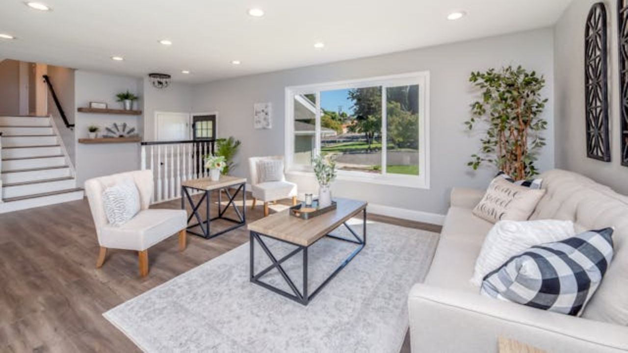
60-30-10 rule for living rooms
The living room is the most shared space in the home, making it the perfect place to apply the 60-30-10 rule. Choose three colors that reflect your personality but are also inviting to others. The key is balancing unique and cozy tones. Wall art is a great way to include your accent color while offering flexibility to switch things up.
Inspiring ideas for applying the 60-30-10 rule
Yoko Chow, interior designer and founder of Yoko Chow Design LLC, suggests a classic and popular color combo:
- 60% white (walls, rug, sofa),
- 30% brown (wood floors, furniture, leather armchairs),
- 10% green (indoor plants, small and large).
According to Elephantstock, this combination is backed by science through the concept of biophilia—the human connection to nature. Studies show that moderate use of natural materials in interior design has positive psychological and physiological effects.
If you prefer a more sophisticated aesthetic, Yoko recommends:
- 60% greige tones (walls, cabinetry, flooring),
- 30% black (countertops, lighting, chairs, appliances),
- 10% gold (cabinet handles, chair legs, outlets, decorative items).
Dare to be creative
Instead of choosing totally different colors, go monochromatic using varying shades of the same hue for a cohesive and elegant effect. Or go for contrast—black and white with a bold pop of color.
Still unsure? Start with your favorite color. Love pastels? A 60-30-10 scheme using pastels creates a fresh and cheerful vibe. Into red? Try a bold look with rust red, white, and orange accents for a high-energy space. The possibilities are endless!
Rules are meant to be broken
Don’t be afraid to adapt the 60-30-10 rule to your own style. If you want to add more shades, you can split the secondary color into 15% + 15% for a personalized touch. Just choose your colors wisely—your space should feel cohesive, not chaotic.
Creative ways to apply the 60-30-10 rule
Beyond paint and furniture, you can also apply this rule to patterns and textures. A large patterned rug might represent 60% of the room, printed curtains 30%, and textured throw pillows the remaining 10%. This creates a visually interesting and well-balanced space.
Whether you’re an experienced designer or a home décor enthusiast, the 60-30-10 rule is a valuable tool for building a harmonious color scheme. Trust your intuition and personal taste to create a beautiful, balanced home!
Source: Elephantstock
This content was created with the help of AI and reviewed by the editorial team.
