
If you want to turn your home into a haven of calm and well-being, choosing the right paint color may be more powerful than you think. The right shade on the walls can reduce stress, boost your mood, and even help improve sleep quality.
+ 6 antiques that work perfectly in modern interiors
To find out which paint colors are the most relaxing, we spoke with professional interior designers who shared the shades they frequently recommend to clients seeking a more serene atmosphere.
From sophisticated neutrals to nature-inspired soft tones, discover below the most relaxing paint colors according to experts — and how to use them stylishly in any room of your home.
1. Light blue: the color of absolute serenity
Light blue is a unanimous favorite among professionals when it comes to visual calm. This color evokes open skies and still water, bringing a sense of space, breath, and inner peace.
“Soft blues are excellent for bedrooms, bathrooms, and reading nooks. They help slow mental activity and encourage relaxation,” explains interior designer Carla M., who specializes in zen-style residential projects.
Pro tip: pair it with neutral tones like beige or warm white, and natural fabrics to create an even more inviting space.
2. Sage green: nature’s touch at home
Another designer favorite is sage green — elegant and soft, it brings the energy of open fields, fresh herbs, and living nature into your home.
“Sage green is perfect for those seeking a soothing and sophisticated décor. It works beautifully in living rooms, kitchens, and even bathrooms,” says architect Lucas Andrade.
This color is especially versatile: it suits modern, classic, or rustic interiors alike.
3. Sand beige: the cozy neutral
For those who prefer a more neutral palette, sand beige is an ideal choice. This tone creates a warm and stable atmosphere, serving as a perfect backdrop for various décor styles.
“Beige doesn’t have to be boring. With the right tone, it becomes a cozy base that conveys warmth and tranquility,” says designer Renata Borges.
It’s a great option for anyone who wants to feel immediate comfort upon entering the home.
4. Soft lavender: a subtle touch of well-being
Soft lavender — a gentle hue between lilac and bluish-gray — is often used to promote relaxation and emotional peace.
“It’s a calming tone that works very well in bedrooms and meditation spaces. It helps slow down both the body and mind,” explains color consultant Bia Torres.
Lavender is especially recommended for people who suffer from anxiety or insomnia.
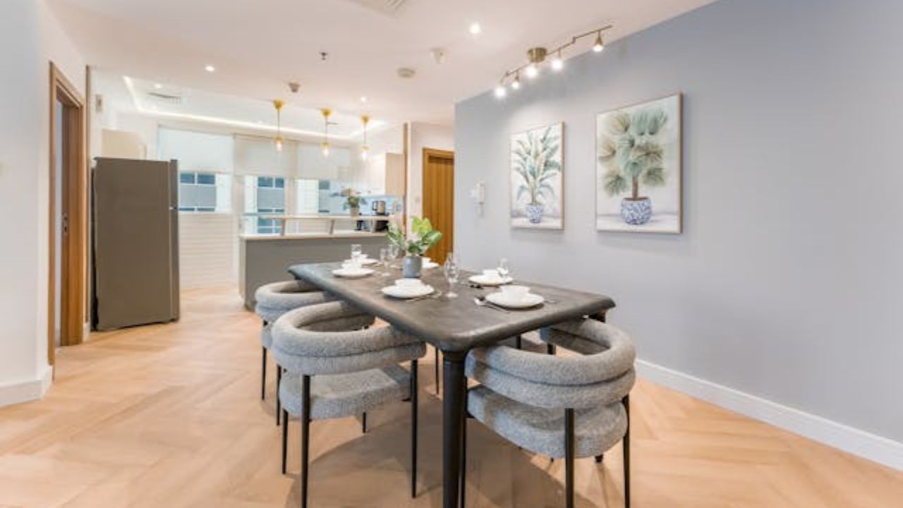
5. Light gray with warm undertone: modern balance
Lastly, light gray with a warm undertone is a contemporary and refined choice, perfect for those who want a neutral space without the cold feel of standard gray.
“This shade is excellent for offices and living areas. It promotes focus and calm without straining the eyes,” says designer Henrique Lima.
Paired with light wood accents or natural elements, warm gray strikes a balance between aesthetics and functionality.
The right color transforms both the space and your state of mind
Choosing paint for your home isn’t just an aesthetic decision — it’s a powerful tool to influence your emotional well-being. If you’re aiming for a calmer, cozier, and more harmonious home, invest in soft, natural, and balanced tones like the ones recommended by interior design professionals.
These colors don’t just beautify your space — they also contribute to a more peaceful and restorative daily life, and that makes all the difference.
This content was created with the help of AI and reviewed by the editorial team.
