Gray has dominated the world of interiors for decades. Color trends come and go, but gray remains a perennial favorite as far back as many interior designers can remember.
However, in recent years, there has been a slow shift in color trends. Our tendency to decorate with gray has become a love-hate relationship, as many homeowners have replaced gray with beige. In 2025, gray is making a comeback—but in a more sophisticated and differentiated way than ever before.
So why is gray having a mini resurgence? This sensual hue pairs well with every color and can be used to add depth and sophistication to any room. The secret is using it in all its variations.
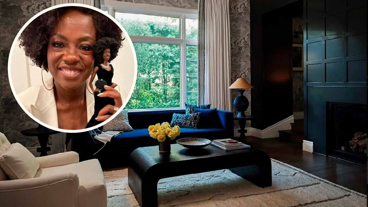
The home of actors-producers Viola Davis and Julius Tennon, designed by Los Angeles interior designer Michaela Cadiz, is a wonderful example of how to make a gray living room look anything but boring.
Gray is a color that has its own climatic system of light levels and shades. From the soft gray morning rain of a wide, bright sky to the breathtaking drama of dark storm clouds, the scope for creating beautiful interiors is infinite. It’s a shade with countless subtle color notes inspired by beach pebbles and clay, as well as slate and charcoal. So you see, gray living room ideas can be just as captivating as any other “color” on the spectrum. Of all the neutrals, gray is the one that instantly brings seriousness.
Gray harmonizes well with almost every other tone, making it a very adaptable neutral and providing a good reason for its popularity, says Helen Shaw, director at Benjamin Moore.
She says there are three approaches to take when using gray as a base. “Tonal grays are perfect for those who want to add an accent color, as a complementary gray with a corresponding warm or cool undertone can be chosen for a harmonious look.” Alternatively, she suggests applying a layer of gray paint with a green undertone: this is a foolproof choice, as green grays sit in the center of the color wheel and favor both warm and cool colors.”
Darker shades of gray tend to work particularly well when paired with touches of bold colors. To make a bolder statement, pair it with cobalt blues and vibrant yellows for a decorative touch. They work beautifully as an accent to a gray scheme and prevent it from looking too cold.
Really, it’s all in the details when perfecting a gray color scheme. “I love using this kind of color on walls because it allows paintings and portraits to really pop,” explains Anna Haines, founder of Anna Haines Design. “It feels calming and serene, and also serves as the perfect backdrop for a variety of rich fabrics, antique decorative rugs, and furniture.”
Source: Homes & Gardens. This content was created with the help of AI and reviewed by the editorial team.
Stay updated on the latest news by following our page on Facebook.
Ver essa foto no Instagram

