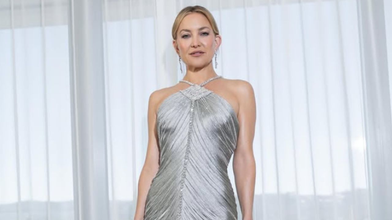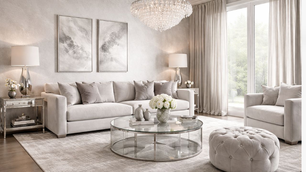
The color of the iconic dress worn by Kate Hudson at the 2016 Golden Globes is officially back — not only on the red carpet, but also as inspiration for interior design.
+ Victoria Beckham’s Closet Combines Luxury, Feng Shui, and Emotional Well-Being
The revival of this sophisticated silver tone gained new momentum after the actress’s recent appearance, analyzed by the website Homes & Gardens, which highlighted how fashion is once again directly influencing interior trends.
During the 83rd edition of the Golden Globes, Kate Hudson drew attention even before the ceremony began when she appeared in a custom-made Giorgio Armani Privé dress. The piece, taken from the Spring 2007 archives, was crafted from flowing charcoal-gray silk, with a halter neckline adorned with Swarovski crystals and long fringes that moved like liquid silver.
Kate Hudson’s look was interpreted as a true lesson in metallic glamour — and a strong indication that this cool palette is ready to return to contemporary interiors.
According to Homes & Gardens’ analysis, the impact of the look is explained by visual familiarity. Around 2016, silver and gray tones dominated interior design on a global scale. Monochromatic spaces, crushed velvet, mirrored furniture, and “millennial gray” walls defined an aesthetic that marked a generation.
Over the years, design shifted toward a warmer approach, favoring earthy tones such as terracotta, sage green, and gold accents. Even so, fashion and décor have always gone hand in hand. Kate Hudson’s choice of such a striking metallic silhouette suggests that the collective desire for luxury in cool tones never disappeared — it simply evolved.
The 2026 version of this trend, as observed by Homes & Gardens, focuses less on flat surfaces and more on texture, light, and depth. Silver gray returns as an element capable of revitalizing functional spaces, adding sophistication without compromising comfort.

Flora Hogg, interior design consultant and color expert at Craig & Rose, explains in an interview with Homes & Gardens that silver gray creates “an elegant and contemporary look effortlessly, evoking a sense of refined sophistication while also serving as a neutral and versatile backdrop.”
Although traditionally paired with white, black, and other metallics, the current approach proposes new harmonies. Warmer neutral tones such as beige and taupe, along with soft greens and purples, help soften the coolness of silver gray and make it feel more inviting.
The key element of this reinterpretation lies in texture. When applied to fabrics, tactile finishes, and embossed surfaces, silver gray gains dimension and warmth. This movement is already reflected in the return of polished chrome lighting fixtures, silk rugs that catch the light, and textured walls that change appearance throughout the day.
If in 2016 the trend was criticized for appearing cold or impersonal, Kate Hudson’s look shows that silver can be expressive, elegant, and even bold when combined with movement and soft materials. As Homes & Gardens points out, this is a new interpretation of luxury: more sensory, luminous, and perfectly aligned with modern interiors.
Source: Homes & Gardens. This content was created with the help of AI and reviewed by the editorial team.

