One of the first lessons in color theory is that opposite tones on the color wheel create intense contrasts: each makes the other appear more vibrant.
In art, this effect can be striking, but in interior design, combining complementary colors like yellow and purple is often seen as a risky — and frequently discouraged — choice.
+ 12 minimalist home ideas to inspire a serene, organized, and sophisticated space
However, renowned designer Pamela Shamshiri — responsible for decorating Anne Hathaway’s home — showed that some rules can (and should) be stylishly broken.
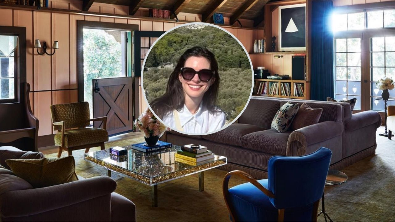
The combination of purple sofas and a yellow armchair: a rebellious touch in Anne Hathaway’s living room
The seating proposal for the actress’s living room includes two purple sofas, harmonized with a mustard yellow armchair and a cobalt blue chair positioned between them.
The result? A creative and surprisingly balanced space. The bold mix of colors, far from seeming exaggerated, shows how contrasting tones can be used with sophistication in contemporary interior design.
As a specialist in celebrity style and decor trends, I can say: this is one of the best color combinations I’ve ever seen in a living room setup.
Why does the purple and yellow combination work so well?
1. Soft and sophisticated tones
The secret lies in the choice of shades. Instead of going for vibrant purple or neon yellow, Shamshiri chose softer versions: lilac and mustard. This palette avoids aggressive contrast, giving the space a refined and cozy atmosphere.
2. Strategic distribution of colors
Another key factor is the color layout. Purple is featured in the sofas, while yellow appears only in the armchair, positioned a few feet away. This separation prevents the tones from visually overlapping, creating a more balanced and fluid effect.
3. Visual cohesion in decor details
To reinforce harmony between the colors, Shamshiri used small elements of each tone in other areas of the room:
- The walls are painted with purplish undertones.
- The books on the coffee table have yellow spines, creating a subtle yet effective link between the different elements.
This resource is a classic interior design technique: creating visual cohesion through subtle color repetitions.
Breaking color combination rules can transform your living room
Although the idea of using purple and yellow in decor may not become the next big trend, Anne Hathaway’s living room proves that daring and stepping out of the conventional can lead to surprising results.
The lesson here is clear: sometimes, breaking a classic design rule — such as avoiding strong complementary colors — can result in a stylish and unique living room.
Get inspired by Anne Hathaway’s living room to create unexpected combinations
The proposal created by Pamela Shamshiri for Anne Hathaway changed my view of the purple and yellow pairing. It’s an example of how mixing opposite colors can work perfectly, as long as you choose the right shades and apply them strategically.
If you want to create a modern, elegant living room with personality, take inspiration from this approach: explore new combinations, experiment with bold colors, but always pay attention to harmony and visual balance.
Source: Homes & Gardens
This content was created with the help of AI and reviewed by the editorial team.
Ver essa foto no Instagram

