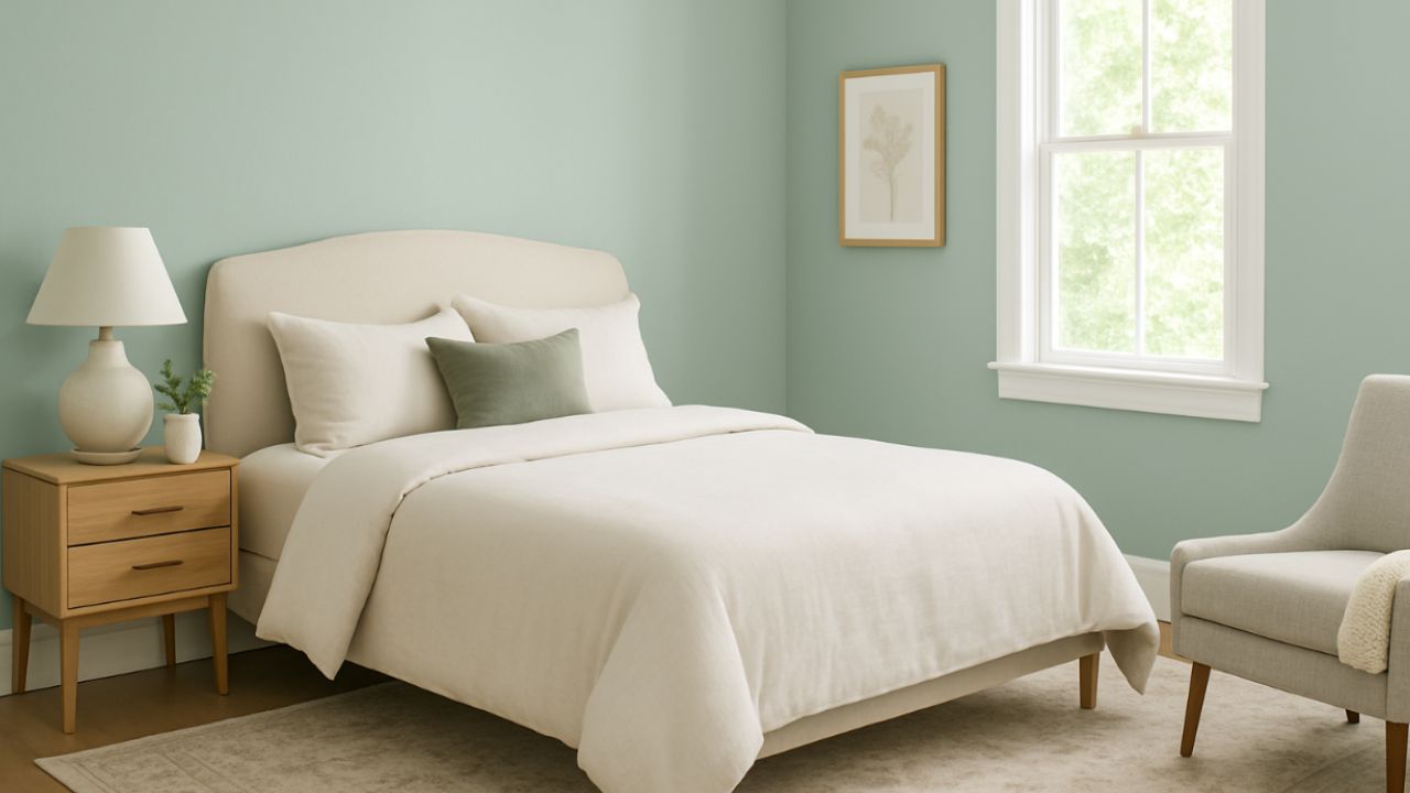
If you’re looking for a versatile, elegant, and timeless paint color to transform your space, designers agree: there is one shade that works with virtually any décor style — from contemporary to rustic, from minimalist to classic.
We’re talking about Sea Salt by Sherwin-Williams — a soft gray-green hue with a bluish undertone that has become a favorite among architects, interior designers, and decorators around the world. But what makes this color so “transitional” and perfect for various styles and spaces?
Why is Sea Salt so versatile?
The main reason Sea Salt works so well in different settings lies in its balanced base of cool and warm tones. Depending on the lighting — whether natural or artificial — it can appear greener, bluer, or even lean toward soft gray. This adaptability allows it to work in both neutral, minimalist décors and more vibrant, personality-filled spaces.
Matches any décor style
- Modern and minimalist style: Its soft tone brings lightness, creating a neutral but not dull base.
- Rustic and farmhouse style: The gray-green tone evokes nature and serenity, pairing well with wood and natural materials.
- Classic style: Perfectly complements white moldings, elegant baseboards, and traditional furniture.
- Boho or Scandinavian style: Serves as an ideal backdrop for natural fibers, plants, and laid-back decor.
A choice that brings well-being
Beyond its aesthetic appeal, Sea Salt is known for conveying calm, tranquility, and coziness. Color psychology studies show that hues inspired by nature — like soft greens and blues — help create relaxing, welcoming environments, ideal for living rooms, bedrooms, offices, and even bathrooms.
Where to use it?
- Full walls: Creates a relaxing atmosphere without feeling heavy.
- Accents: Works beautifully on feature walls, doors, furniture, or even kitchen cabinets.
- Small spaces: Its lightness visually expands the area.
- Rooms with lots of natural light: The light shifts the perception of the color throughout the day, adding movement to the room.
Perfect combinations
Designers recommend pairing Sea Salt with:
- Warm whites (for baseboards, doors, and ceilings).
- Earth tones and light woods, which enhance the natural vibe of the color.
- Gold or bronze metals for a sophisticated touch.
- Deep blues and dark greens for a bold and elegant contrast.
Whether you’re doing a full renovation or just giving your space a refresh, Sea Salt is a smart choice. It’s the go-to color that never goes out of style and transitions effortlessly across various design styles with grace and charm.
Designers confirm: when it comes to choosing a versatile, beautiful, and inviting paint color, this is the one everyone should consider.
This content was created with the help of AI and reviewed by the editorial team.

