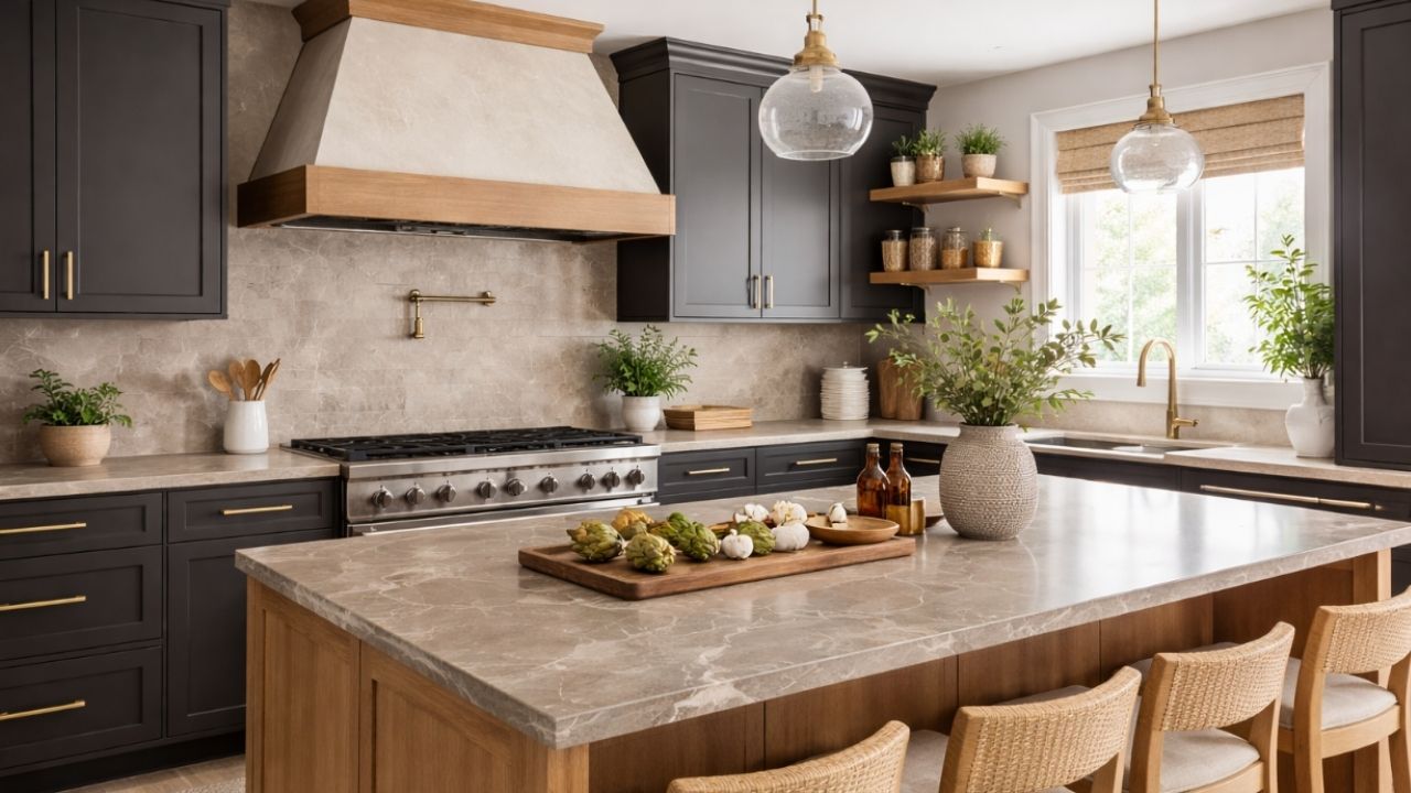
The countertop is one of the most impactful elements in the kitchen — both visually and functionally. For this very reason, choosing a color goes far beyond personal taste: it can enhance the space or make the kitchen look dated in just a few years.
+ 10 landscaping tips we wish we had learned earlier on TikTok
According to interior designers, some shades that were once popular now tend to age kitchens more quickly, especially when they do not work well with the lighting, cabinetry, and overall design style.
See the 4 countertop colors that professionals say to avoid — and understand why.
1. Yellowish beige
For many years, countertops in warm or yellow-toned beige dominated both classic and contemporary kitchens. Today, however, designers point out that this color often gives the space a dull and outdated appearance, especially when paired with light-colored cabinets.
In addition, yellowish beige tends to reflect light poorly, making the kitchen appear darker and visually less clean.
Why it ages the space: it conveys an aesthetic strongly tied to past decades and loses freshness alongside modern finishes.
2. Absolute black with a polished finish
Although it looks sophisticated at first glance, fully polished black is frequently cited by designers as a choice that can weigh down the space over time. It highlights stains, fingerprints, and splashes, which compromises its everyday appearance.
As the years go by, the intense shine can also feel excessive in kitchens that follow more natural and welcoming trends.
Why it ages the space: it creates a harsh, less organic contrast and requires constant maintenance.
3. Dark brown
Countertops in deep brown, very popular in the 2000s, are now seen as one of the finishes that most clearly reveal the age of a kitchen. Designers explain that this shade absorbs light and makes the space look visually smaller.
In current projects, the preference is for colors that expand and brighten the space, especially in open-plan kitchens.
Why it ages the space: it recalls a heavy aesthetic that is poorly aligned with contemporary color palettes.
4. Cool medium gray
Gray was once synonymous with modernity, but the medium, cool shade — especially on very uniform surfaces — is increasingly associated with kitchens lacking personality. Designers note that this type of gray can make the space feel cold and impersonal.
As trends evolve, an excess of gray is being replaced by warmer, more natural tones with subtle variations.
Why it ages the space: it lacks visual depth and a connection to natural materials.
What designers are choosing instead
Instead of these colors, professionals are opting for:
- light tones with warm undertones
- stone surfaces with soft, natural veining
- satin or lightly matte finishes
- timeless colors that evolve with design trends
The main recommendation is to think of the countertop as a long-term element. More than following trends, choosing a balanced color that is well integrated into the design ensures a kitchen that stays current for many years.
When thoughtfully selected, the countertop not only stands the test of time — it enhances the entire space.
This content was created with the help of AI and reviewed by the editorial team.

