
In the world of interior design, colors play a central role: they set the atmosphere, influence mood, and even affect the perception of space. But not every choice that feels perfect today will stand the test of time.
+ How to Find Your Interior Design Style: The Transformative Tip That Changed Everything
According to design and color experts, some shades that are popular now will likely be seen as “dated” a decade from now.
As a designer, I’ve learned that extreme trends have an expiration date. Below, we look at five paint colors you might love now but that carry a serious risk of future regret — along with more timeless alternatives for each case.
1. Excessive cool gray
Light gray with bluish undertones has dominated residential design in recent years, especially on living room and bedroom walls. The problem? This “cold” neutrality can make a space feel impersonal and monotonous.
Why it will date: with the rise of warmer, cozier palettes, cool gray may seem lifeless and “a thing of the past” in 10 years.
Timeless alternative: opt for sophisticated beiges, sandy tones, or greige (a mix of gray and beige), which maintain neutrality but with warmth and versatility.
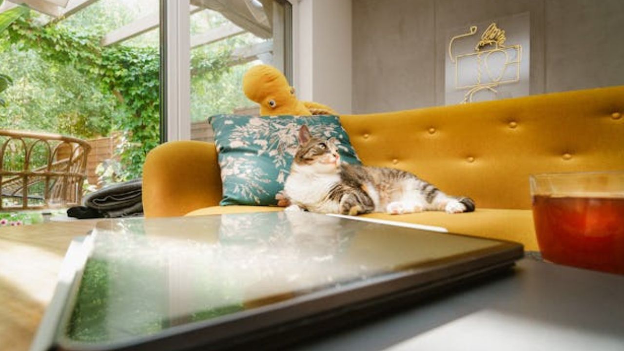
2. Neon yellow or fluorescent colors
Vibrant, fluorescent colors have bold appeal, but they’re hard to harmonize and quickly become overwhelming. They tend to be strongly tied to specific eras — and when the trend fades, the space feels instantly outdated.
Why it will date: high visual intensity, low adaptability, and visual fatigue over time.
Timeless alternative: burnt yellows, soft golds, or mustard shades. They still bring energy but in a more refined way.
3. Too much navy blue
Navy blue is elegant, but using it excessively on all walls of a space can create a heavy atmosphere. It works beautifully as an accent color but not as the dominant tone in every room.
Why it will date: although classic, overuse of navy can feel closed-off and overwhelming, especially in small spaces.
Timeless alternative: medium blues or blue-greens (like teal), which provide depth without weighing down the space.
4. Neon green or lime green
The surge in vibrant green was driven by digital trends and influencers, but on residential walls, it tends to lose its charm quickly.
Why it will date: strong visual impact, difficult pairing with furniture and accessories, and quick association with a specific “fashion year.”
Timeless alternative: moss, olive, or sage greens — all offer freshness with a natural sophistication that endures for decades.
5. Overly sweet pastel tones
Bubblegum pink, sugary lilac, and baby blue create a delicate and even nostalgic look, but when overused, they can make a space feel childish or overly themed.
Why it will date: these tones are strongly tied to specific styles and can limit the room’s evolution over the years.
Timeless alternative: more “grown-up” versions of the same colors — like dusty pink, grayish lavender, or muted blue — that keep the charm but add sophistication.
Color choice goes far beyond following trends: it should harmonize with the architecture, lighting, and personality of the residents. According to experts, the key to avoiding regret is to invest in timeless shades that can adapt to your evolving style and withstand changing trends.
If you still want to embrace trendy colors, limit them to small details, accent walls, or accessories — that way, when the trend passes, the update will be simple and cost-effective.
This content was created with the help of AI and reviewed by the editorial team.
