
Choosing the right color for a room can completely transform a space. That’s why many people naturally turn to the most popular shades as a starting point.
+ The common living room mistake that makes your entire home look outdated
However, interior designers warn: although these classic colors work well in a variety of styles, there are more current and personalized alternatives that can take your décor to the next level.
If you’re thinking about refreshing your walls, find out which are the 5 most used paint colors and what the experts suggest as replacements—offering bolder, cozier, or more sophisticated tones.
1. Ice White: Try a Warm Off-White
The classic: Ice white is a safe and widely used choice because of its neutrality. It visually enlarges spaces and reflects light well but can feel cold or impersonal.
The designers’ suggestion: Opt for a warm-based off-white, such as vanilla, ivory, or light sand. These tones maintain the brightness of white but create a cozier and more sophisticated environment—ideal for living rooms, bedrooms, and open spaces.
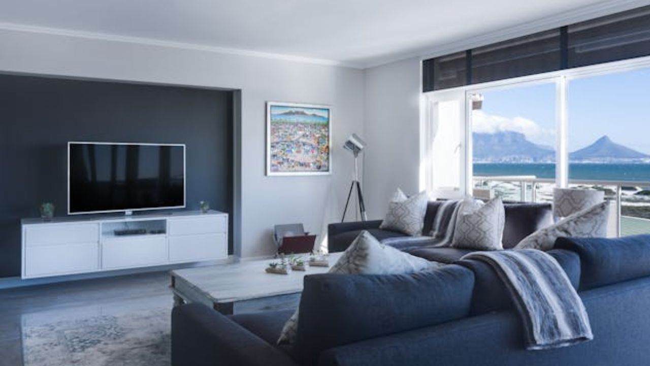
2. Medium Gray: Try Sage Green
The classic: Medium gray has become a favorite over the past decades, especially in minimalist and industrial projects. However, its overuse can make spaces feel monotonous.
The designers’ suggestion: Sage green is an elegant and contemporary alternative. This earthy and soft color brings freshness, tranquility, and an organic touch to the space, making it perfect for kitchens, offices, and dining rooms.
3. Traditional Beige: Try Soft Terracotta
The classic: Beige is versatile and easy to match, but its extreme neutrality can leave a space lacking personality.
The designers’ suggestion: Soft terracotta is a more up-to-date choice. Shades like light clay or burnt peach add warmth and a subtle earthy touch without overwhelming the space. It looks great in entryways, naturally lit living rooms, and even powder rooms.
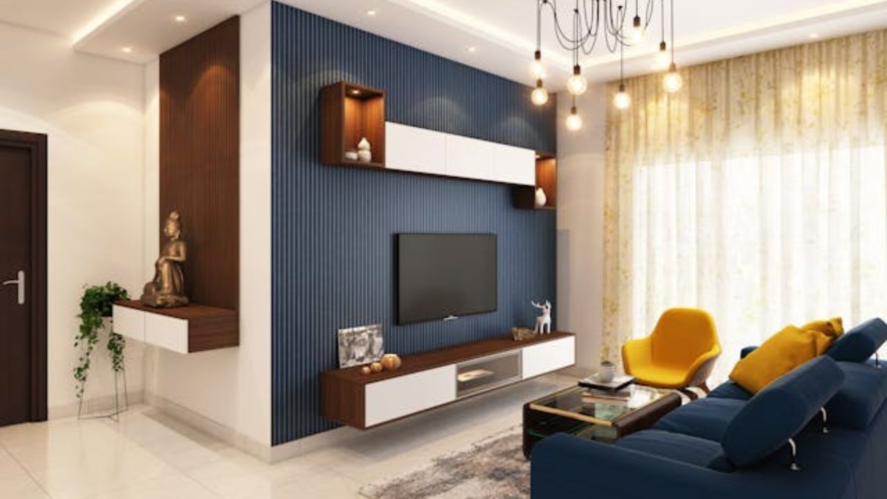
4. Navy Blue: Try Grayish Blue
The classic: Navy blue is timeless but can make a room too dark—especially smaller spaces or those with little natural light.
The designers’ suggestion: Go for grayish blue or “mist blue.” This lighter, foggy tone adds elegance and depth without compromising brightness. Ideal for bedrooms, bathrooms, and offices.
5. Solid Black: Try Deep Moss Green
The classic: Black walls are often used to create visual impact and drama. However, in many cases, it can absorb too much light and create a confined feeling.
The designers’ suggestion: Deep moss green retains the drama of black but with a more natural and versatile touch. It’s a bold choice that still feels inviting. Perfect for accent walls, libraries, or TV rooms.
Refresh with Personality
Updating your home’s color palette doesn’t mean abandoning the timeless—it means reinterpreting these choices with creativity. By replacing the most common tones with warmer, more natural, or bolder versions, you can transform any space into an authentic reflection of your style.
Remember: applying a new color is one of the most accessible ways to refresh a space. And with the right guidance, even small changes can make a big difference.
This content was created with the help of AI and reviewed by the editorial team.
