
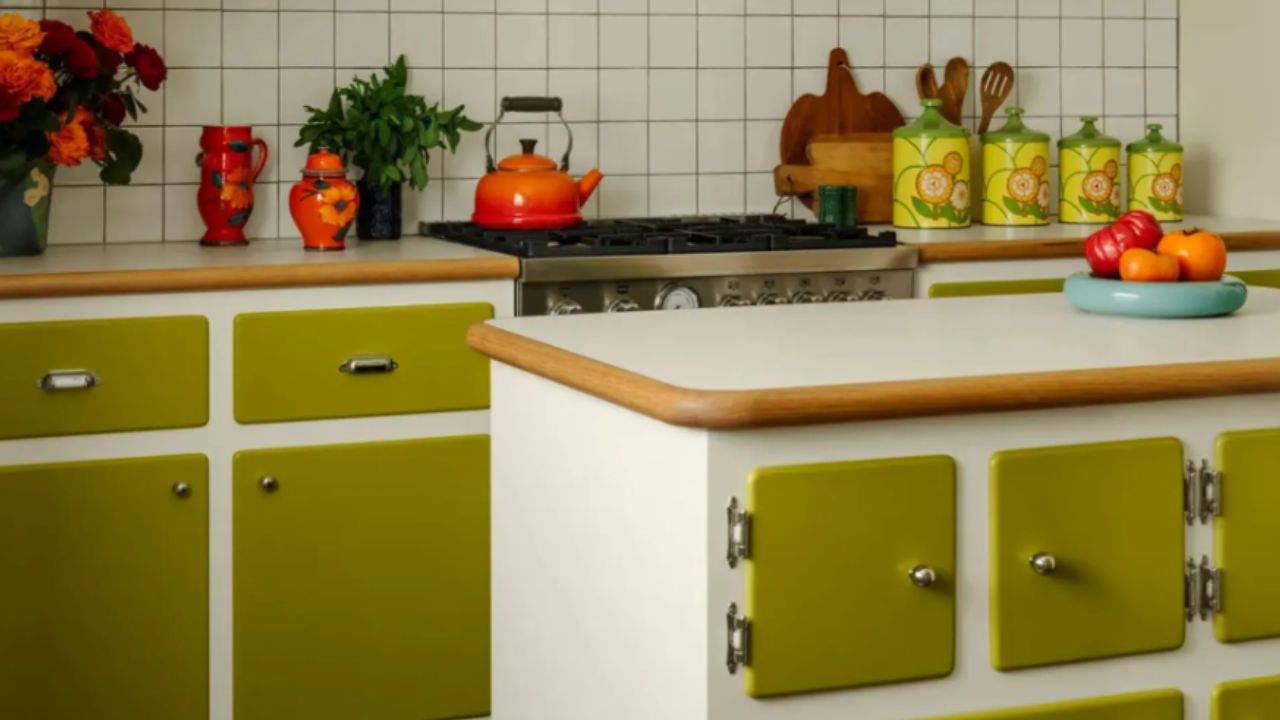
Not quite green, not fully yellow — the olive oil shade sits perfectly between the two. Natural yet surprising, this tone is set to become one of the most desired choices for those looking to refresh their kitchen in 2025 with style and sophistication.
+ Lana Del Rey’s Kitchen Ignores Passing Trends in Favor of a Timeless Palette
The trend color that was already in your kitchen. The most unexpected décor inspirations often come from everyday objects. Who would’ve thought a simple bottle of olive oil on the counter could point the way to such a strong interior color trend? This tone, once overlooked, is now standing out and gaining space beyond the culinary world.
This new color approach was recently highlighted by Hugh Metcalf, editor at Livingetc, and has since been frequently seen in interior design projects. The olive tone combines vibrancy, depth, and a touch of mystery — making it an excellent choice for those who want to add personality to their space.
Its connection with earthy tones and perfect timing as a trend
The growing interest in natural and earthy colors in décor helps explain why olive oil is trending. Additionally, the sophisticated and visually striking design of artisanal olive oil packaging has contributed to this color’s rise as an aesthetic reference.
The olive oil tone pairs beautifully with organic palettes while standing out as a bold and unique hue.
What defines this color and how to use it in décor
Olive oil shades are not one-size-fits-all: they vary depending on the product and lighting. In a supermarket, for instance, you might see tones ranging from dark green to golden yellow — and this diversity translates to interiors too.
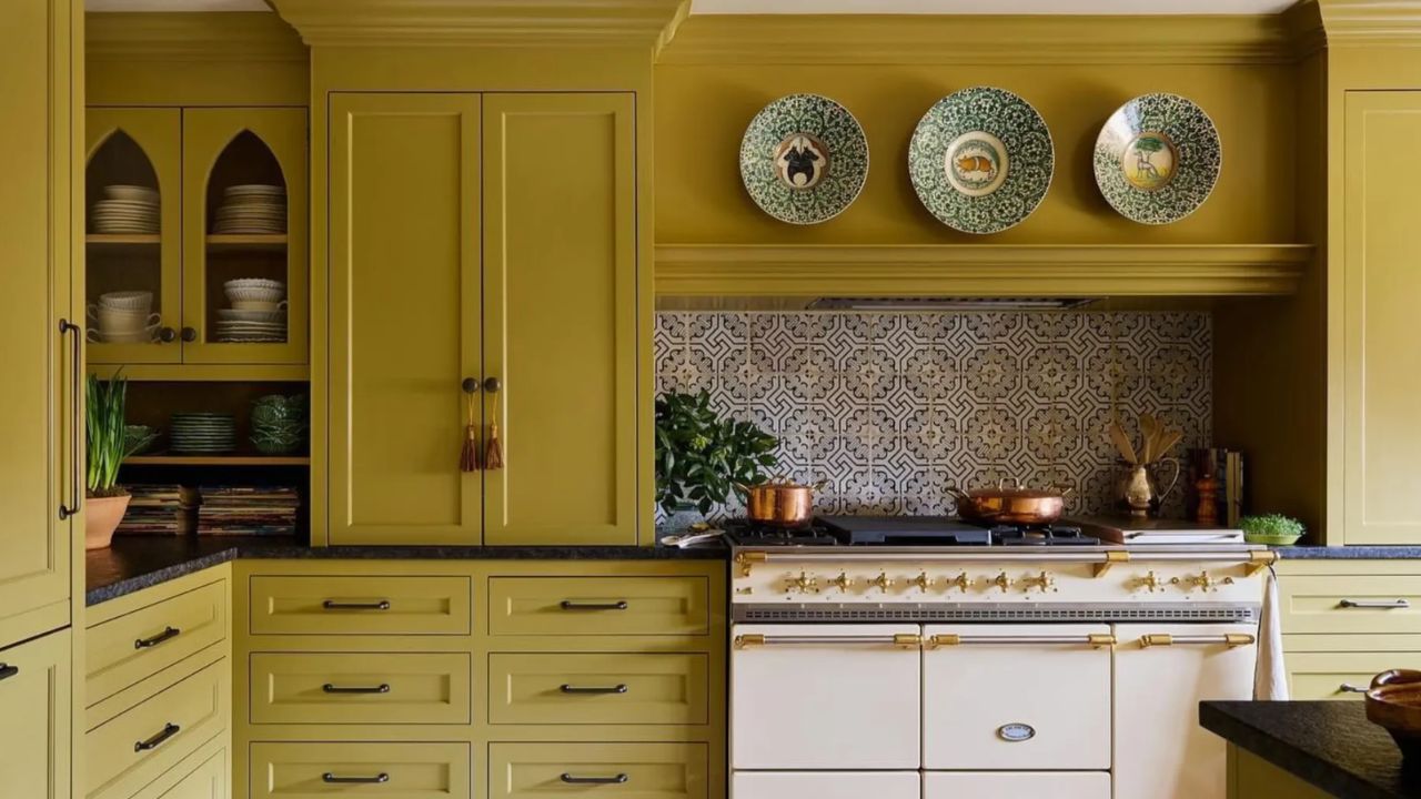
According to Patrick O’Donnell, color expert at Farrow & Ball, lighter olive tones create bright and calm atmospheres, ideal for open spaces. Darker versions, such as the brand’s “Bancha,” have a bolder, more impactful presence — perfect for those seeking standout design while keeping a cozy feel.
At the center of the spectrum is the tone closest to real olive oil: a balance between green and yellow, with a soft golden glow. Interior designer Sarah Latham describes this hue as a “rich amber green,” sophisticated and inviting.
Though still relatively rare in residential projects, this tone is gaining ground thanks to its refined aesthetic and strong visual impact.
Smart pairings with the olive color
As a naturally earthy tone, olive oil easily complements neutral colors like brown, beige, and ivory. Sarah Latham explains that these combinations create a sophisticated visual harmony without effort.
But olive goes further: its versatility allows for bold pairings. Patrick O’Donnell suggests combining it with dark blues or deep browns for a contemporary elegance. Lighter pairings with blush pink or soft white create a more classic and cozy feel.
Even dramatic mixes — like with purple or navy — result in spaces full of style and personality. “Olive brings a sense of comfort and sophistication,” says Sarah, highlighting its transformative potential across different rooms.
Where to use olive oil tones at home
Thanks to its richness and tonal variety, olive oil can be used in many areas of the home. Patrick recommends applying it in kitchens (especially cabinets), guest rooms, and even powder rooms. Its versatility is one of the tone’s greatest strengths.
For an easy and affordable option, Sarah suggests textiles like olive-toned bedding in neutral rooms. This adds depth without major structural changes.
If painting walls or surfaces, lighter olive tones work particularly well in spaces with natural light, where their subtleties can shine with softness and elegance.
For furniture and decorative accents, start small: a lamp, pillows, dishes, or a standout furniture piece. A few touches here and there are enough to explore the beauty of this color before diving in completely.
A promising shade that’s here to stay
Olive oil is bold, refined, and full of character. While considered one of the top color trends for 2025, its appeal goes far beyond a passing fad. Sarah believes it has the potential to become a classic in interior design.
Patrick agrees: “Trends come and go, but because olive oil belongs to the green family, it will always have a place. Greens and blues are timeless, and this particular shade has everything it needs to stay relevant for many years.”
Source: Livingetc
This content was created with the help of AI and reviewed by the editorial team.
