
Some decorating mistakes can make a space look disorganized, outdated, or simply unpleasant to the eye—and the worst part: it can happen instantly.
Choosing the wrong decor, such as an inadequate rug, poorly positioned furniture, an unharmonious color palette, or the wrong type of curtain, are details that make all the difference in the final result of a space.
+ Paul McCartney turned an ordinary door into a stunning work of art
To help you avoid these interior design traps, we spoke with professional designers who pointed out the main signs of tacky decor and explained how to correct them with simple and effective solutions.
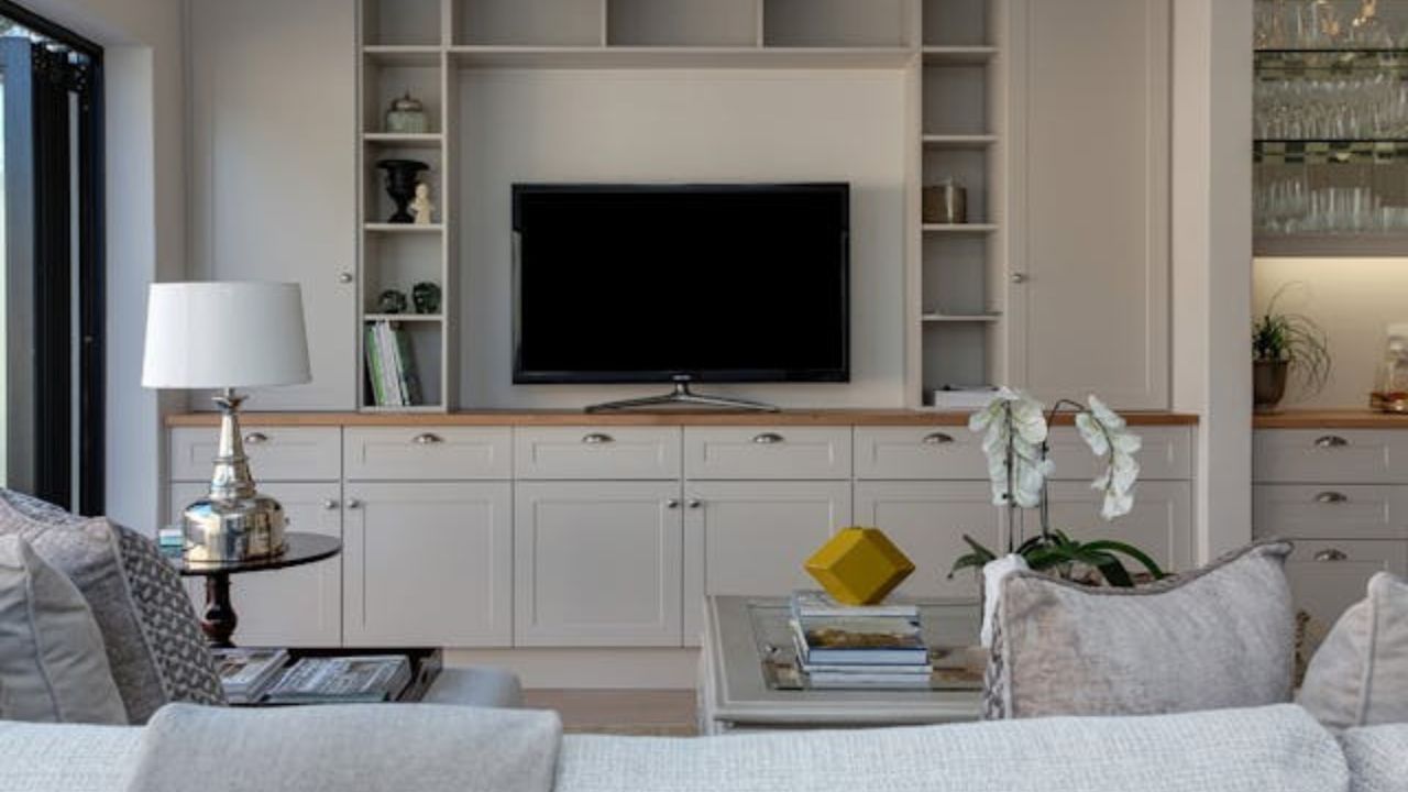
1. Using the TV as the focal point of the living room
Arranging the entire room around the TV is one of the most common and limiting mistakes in living room decor. While it’s a feature in nearly every home, the TV shouldn’t be the center of attention when it comes to layout.
“There’s no avoiding the TV in most living rooms, but that doesn’t mean it has to dominate the space,” says designer Erin Williamson.
Instead of positioning all sofas and chairs directly facing the screen, consider creating more versatile conversation zones. Swivel chairs, for instance, allow you to shift focus between conversation and the TV depending on the occasion. This creates a cozier and more functional atmosphere.
2. White and empty walls
Completely white and undecorated walls don’t convey modernity—on the contrary, they can feel cold, impersonal, and even neglected.
“Painting a dark space white won’t necessarily make it brighter. The result might be a washed-out look, lifeless and lacking architectural personality,” Williamson explains.
Opt for mid-tones like warm grays, olive greens, or beiges that create an ideal backdrop for highlighting furniture and decorative pieces. For those seeking something more dramatic and cozy, dark colors can also be used stylishly, especially in reading nooks or bedrooms.
3. Choosing the wrong curtains for the space
Curtains have the power to completely transform a room’s aesthetic—for better or worse. Inappropriate fabrics, out-of-context colors, or incorrect lengths are details that instantly reveal tacky decor.
“Avoid shiny fabrics like dupioni silk in casual spaces. They create a forced contrast. Velvet, for example, doesn’t perform well in spaces with lots of sunlight and heat,” warns Williamson.
Another common mistake: white curtains on equally white walls, especially if the rest of the decor doesn’t follow that palette. The result is a sterile space with no charm. Choose warm neutral tones like ocher or oatmeal that work well in a variety of decorating styles.
4. Furniture that’s too small (or too much of it)
The proportion of furniture in relation to the room is essential to achieve visual harmony. Furniture that’s too small—especially in excess—can make the space feel cluttered, cramped, and unfocused.
“Choose a larger piece to anchor the space, like a robust sofa or a striking coffee table, and complement it with furniture in various sizes,” suggests Williamson.
The idea is to balance the space with pieces of different scales, creating a visual composition that is both interesting and functional.
5. Overly saturated light blue
Pastel blue tones can be charming, but when overused or applied in very saturated shades, they result in a childish and artificial look—the infamous “Easter baby room.”
“If you use a very saturated light blue, the space can feel cold and unbalanced. A slight hint of green can help soften the tone,” explains Williamson.
Rather than sticking to pure blue, try mixing it with grayish tones or natural elements to break the visual stiffness.
6. Rugs that are too small for the space
Few things reveal poorly planned decor like an undersized rug. A small rug can make the entire room feel disconnected and purposeless.
“If I walk into a room and see a rug that’s too small, it immediately draws attention in a negative way,” says Christina Kim.
The golden rule is clear: all furniture legs should either be on the rug or completely off of it—never halfway. Also, choose a rug that respects the room’s proportions to ensure visual comfort and warmth.
7. Poorly planned gallery walls
A gallery wall can be a powerful visual feature when done well. However, when poorly planned, with few frames or lacking aesthetic coherence, the result is sloppy.
“When it comes to a gallery wall, you either go all in or don’t do it,” says Kim.
Use frames with a common aesthetic (like all black or all gold) or choose a thematic curation—such as black and white photos—to ensure a cohesive and elegant presentation.
8. Too uniform metal finishes in decor
Using only one type of metal finish throughout the house can make it feel outdated. The current trend in interior design values the mixing of metals and textures.
“Mixing metal finishes like gold, copper, brass, and brushed steel adds depth and sophistication to a space,” Kim affirms.
This blend creates a modern, refined aesthetic full of personality.
9. Curtains that are too short
Curtains that stop above the floor interrupt the room’s visual flow and create the feeling that something is “off” in the decor.
“I have a personal list of design crimes, and short curtains are at the top,” says Jojo Barr.
The exception is delicate French café curtains, which work well in kitchens or bathrooms with a romantic feel. For all other cases, opt for curtains that touch the floor or invest in Roman shades.
10. Overuse of gray
The “all-gray” trend had its moment, but today, committing to a 100% gray palette conveys coldness and lack of creativity.
“Earth tones are much more effective in creating a warm and timeless space,” says Barr.
Take inspiration from nature to bring color and coziness to your home: clay tones, moss green, beige, caramel, and even terracotta are in style and pair well with various decor styles.
11. Glass coffee tables
Although practical, glass-top coffee tables often give off a cold and corporate vibe, breaking the charm of the living room.
“They make the space feel cold and impersonal. Choose natural materials like wood, which bring texture and visual warmth,” concludes Barr.
Want to make your home more beautiful, cozy, and professional-looking? Avoiding these decorating mistakes is the first step to transforming your space into a harmonious and stylish home.
Source: The Spruce. Photos: Pexels
This content was created with the help of AI and reviewed by the editorial team.
