
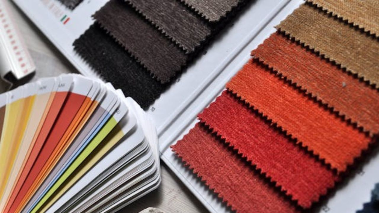
The choice of a color palette is one of the most important factors in interior design. When applied well, it conveys harmony and sophistication; but when it goes wrong, it can make a space feel heavy, outdated, or even unpleasant to the eye.
+ Decor Purchases Minimalists Regret the Most, According to Experts
According to AOL, there are color combinations that, although popular at certain times, have not stood the test of time and are no longer favored by experts today.
1. Navy Blue and Coral
For designer Melinda Browning, this combination may seem fresh and youthful, but it results in a childish and outdated look. She suggests replacing coral with more sophisticated tones such as rust, mustard, or ocher, which harmonize better with deep blue.
2. Brown and Burgundy
According to Tina Guevara of Juliette Sebastian Interiors, brown and burgundy immediately evoke 1990s basements. The palette is considered heavy and lacking in timelessness, contrasting with today’s preference for lighter, more refined spaces.
3. Gray and Yellow
Design director Micaela Quinton of Copper Sky Design + Remodel states that this was the most overused duo of the 2010s, marked by chevron patterns and industrial furniture. Today, the trend is to invest in warm earthy neutrals and softer or deeply saturated shades.
4. Red and Black
According to Amy Peltier of Peltier Interiors, this is one of the heaviest and most aggressive combinations for residential spaces. While strong individually, together they lose the softness and welcoming feel desired in contemporary design.
5. Purple and Orange
Designer Allison Garrison of Allito Spaces considers this pairing excessively contrasting. However, lighter variations, such as lavender and peach, can create a delicate and functional palette.
6. Overly Seasonal Combinations
According to Melanie Bryant, colors that evoke specific holidays, such as red and green (Christmas) or black and orange (Halloween), limit decoration. Outside of those times, they feel out of place and lack versatility.
7. Burgundy, Gold, and Ivory
Designer Tehilla Bennett of Teela Bennett Designs explains that this palette recalls banquet halls from the 2000s, conveying excessive formality and a dated air. She recommends replacing it with more subdued tones and balanced textures.
8. Apple Red and Lemon Yellow
For Shannon Askinasi of Ash & Pine, this duo brings to mind ketchup and mustard. While unpleasant in its saturated version, variations such as rust red and ocher can convey warmth and elegance.
Using the right colors transforms any space into a sophisticated and welcoming environment. As AOL highlighted, the key lies in avoiding dated or aggressive palettes and opting instead for combinations that convey balance, versatility, and timelessness.
Source: AOL. This content was created with the help of AI and reviewed by the editorial team.
