
With the arrival of 2026, interior design undergoes a subtle yet meaningful transformation. The search for well-being, visual lightness, and emotional connection with spaces directly influences color choices.
+ Mark Ruffalo’s kitchen shows how mixing materials can be elegant even in small spaces
According to designers and interior specialists, next year’s palette reflects a balance between nature, sophistication, and contemporary comfort.
Discover the seven colors that promise to refresh spaces and bring freshness into homes in 2026.
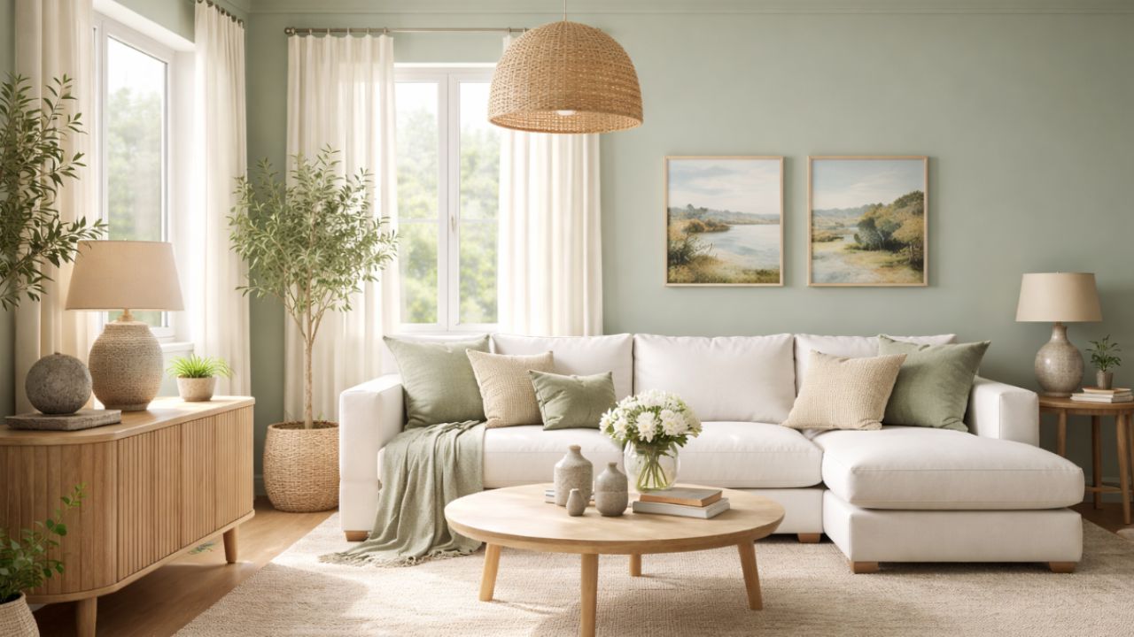
Sage green
Sage green remains one of the most beloved colors in contemporary design. Soft, elegant, and extremely versatile, it creates calm and welcoming environments. In 2026, it appears as an alternative to darker greens, working well in living rooms, bedrooms, and even kitchens.
In addition to being refreshing, this shade conveys a sense of balance and connection with nature without visually weighing down the space.
Mist blue
Lighter and more ethereal than traditional blues, mist blue stands out for its ability to brighten spaces without making them feel cold. It works especially well in environments that receive plenty of natural light.
Designers recommend this tone for bedrooms, bathrooms, and home offices, as it promotes calm, mental clarity, and a sense of lightness.
Sand beige
Neutrals remain strong, but with new nuances. Sand beige replaces cool grayish tones, bringing more warmth and naturalness into spaces. It is ideal for those seeking a timeless, elegant, and easy-to-combine look.
In 2026, this shade appears on walls, upholstery, and large surfaces, creating a neutral and sophisticated base for other decorative elements.
Soft terracotta
Inspired by earth and natural materials, terracotta gains a lighter and more delicate version. Less intense than the traditional tone, it adds personality without overwhelming the space.
Designers recommend soft terracotta for details, accent walls, or decorative objects, especially in living rooms and social areas.
Butter yellow
Discreet, warm, and inviting, butter yellow emerges as the right choice for those who want to bring light and freshness into a space without excess. Unlike vibrant yellows, this tone creates a soft and optimistic atmosphere.
It works very well in kitchens, bedrooms, and small spaces, helping to visually enlarge the room.
Warm gray
Gray remains in the spotlight, but in 2026 it appears with a warmer undertone. This variation avoids visual coldness and better suits environments that prioritize comfort and sophistication.
Warm gray is ideal for those who want to maintain a contemporary aesthetic, pairing well with wood, natural fabrics, and indirect lighting.
Light petroleum blue
Petroleum blue takes on a lighter and more modern interpretation. In its light version, it adds depth without heaviness, making it an excellent option for those who want to move beyond the obvious without being too bold.
This shade is suitable for living rooms, offices, and even bedrooms, especially when combined with neutral tones and well-planned lighting.
Colors that reflect well-being and naturalness
The colors of 2026 reflect a collective desire for lighter, more comfortable environments connected to positive sensations. The trend is not to completely transform spaces, but to update them with conscious, natural, and visually pleasing choices.
By choosing these tones, it is possible to renew the home in an elegant, current, and fully contemporary way.
This content was created with the help of AI and reviewed by the editorial team.
