
The season of parties and gatherings brings a higher flow of visitors, making the dining room one of the most closely observed spaces in the home. Beyond a well-set table, proper lighting, and comfortable seating, there is one detail that often makes an immediate impact: wall color. Ideally, it should create a warm and elegant atmosphere — not compete with the dining experience.
+ 5 rooms to organize now and prepare for the end-of-year holidays
However, some colors still appear frequently in dining rooms, even though they no longer appeal to professionals in the field.
According to The Spruce, interior designers point out certain shades as poor choices for dining rooms precisely because they cause visual discomfort or convey undesirable feelings.
Here are which ones they are — and what to use instead.
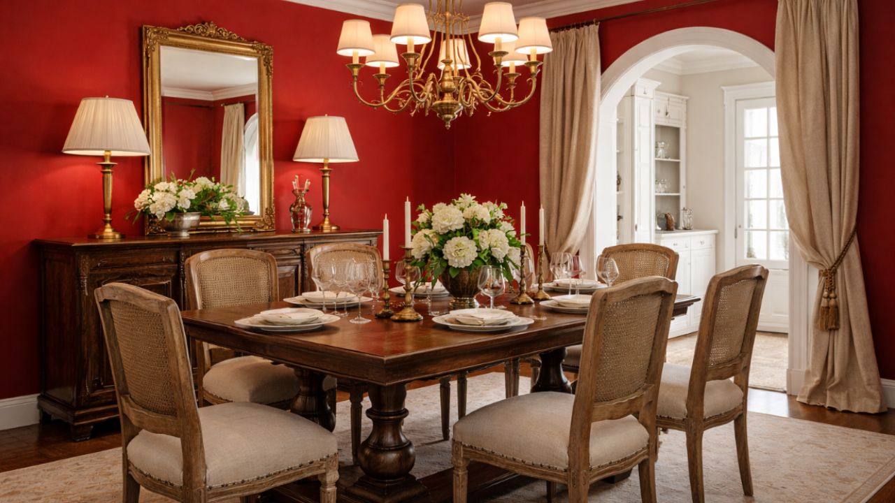
Cherry red
Designers are unanimous: vibrant cherry red does not work well on dining room walls.
“Nothing raises blood pressure like an intense red,” says Lindsay Thornton, founder of Cornerstone Custom Build. While it can be an interesting color for doors or small accent details, when it dominates the space it tends to make guests feel tense.
The alternative is to choose deeper, more elegant versions such as wine, merlot, or dark red. Another solution is to reserve cherry red only for decorative objects, such as vases or centerpieces.
Bright white
On the opposite end of the spectrum, pure white also makes the list of problematic colors. Although it is seen as safe and timeless, this shade can make the dining room feel cold and impersonal.
According to experts consulted by The Spruce, overly bright white creates a “showroom” effect, lacking coziness or a sense of warmth. For a more sophisticated result, opt for warm off-whites, cream tones, or soft beige.
Intense yellows
Strong, vibrant yellows may seem cheerful in theory, but they rarely work well in practice. At night, under artificial lighting, these shades can become aggressive and tiring on the eyes.
This includes neon, electric, or overly saturated yellows. The best alternative is to choose softer versions such as light ochre or a subtle golden yellow, which maintain a sense of warmth without excess.
Cold blues
A dining room calls for comfort — exactly the opposite of what cold, icy blues convey. These tones tend to create a distant and uninviting atmosphere.
That does not mean banning blue from the space. Designers recommend warmer, earthier versions, as well as soft grayish blues that preserve the calming effect of the color without compromising coziness.
Anything neon
Neon colors — such as fluorescent green, pink, purple, or yellow — are almost always considered a mistake on dining room walls. While fun in small details, they quickly overwhelm the space when used on large surfaces.
These tones work better in more relaxed environments, such as home gyms, game rooms, or creative studios. For the dining room, the rule is clear: less visual stimulation, more elegance.
Teal
Blue-green and turquoise had their peak in interior design, but today they feel dated and artificial. Many designers believe this color has been overused and has lost its freshness.
The ideal replacement is more natural tones: soft greens with a blue base or light blues with green undertones, which offer a current and sophisticated look without excess.
Gray
Gray is a controversial classic. While it never completely disappears from trends, it has been criticized when used excessively, especially in dining rooms.
“It’s a tone that sucks the energy out of a space,” explains designer Mugdha Girish Uma. In decorative items, gray can work well, but on entire walls it tends to leave the room feeling lifeless — the opposite of what is expected from a space meant for gathering.
To replace it, consider greiges (a mix of gray and beige), sand tones, or light browns, which maintain neutrality with much more visual warmth.
Source: The Spruce. This content was created with the help of AI and reviewed by the editorial team.
