
Have you ever walked into a room and immediately felt a heavy atmosphere, without knowing exactly why? The wall color might be the reason.
Some paint shades may look chic or neutral in the store but end up making rooms feel gloomy, dark, or even demotivating in everyday life.
To help you avoid that, we’ve listed 6 paint colors that tend to carry a “sad” vibe — and, more importantly, we suggest alternatives that will lift your home’s mood!
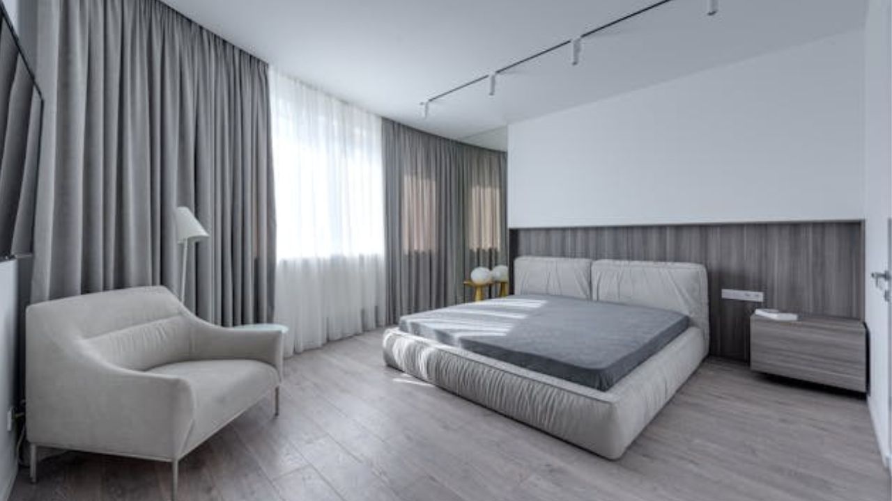
1. Charcoal gray (too dark)
Though elegant, a very dark gray can make a space feel oppressive, especially with little natural light.
Alternative: Go for a light gray with warm undertones, like “greige” (a mix of gray and beige), which stays neutral without feeling heavy.
2. Dull moss green
This earthy, muted tone can make rooms look dated and gloomy, especially in smaller spaces.
Alternative: Try light olive green or sage green, which bring calm and a natural feel without weighing down the look.
3. Old yellowish beige
Often found in older homes, this beige can give off a musty or visually tiring vibe.
Alternative: Choose modern sand tones or beige with a soft pink undertone to add warmth and softness to the space.
4. Icy blue-gray
While it may seem elegant in a paint swatch, this blue with gray undertones can feel cold and emotionally distant.
Alternative: Opt for a light blue with lavender hints or a soft teal, which adds calmness and personality.
5. Reddish brown
This dark tone can remind you of stuffy or outdated interiors, especially when overused.
Alternative: Go for light terracotta or soft clay hues, which keep the coziness but add freshness and modern appeal.
6. Super cool white (almost bluish)
It seems like a safe choice, but white with bluish undertones can make a space feel sterile and impersonal.
Alternative: Choose whites with yellow or warm neutral undertones, which still brighten a space without feeling clinical.
The right color transforms your home’s energy
Paint color is about more than just aesthetics — it directly affects your well-being. Avoiding tones that “drag down” the environment and choosing uplifting hues is key to a cozier, more vibrant, and welcoming home.
Pro tip: Always test the color on your wall at different times of day to see how it reacts to natural and artificial light.
This content was created with the help of AI and reviewed by the editorial team.
