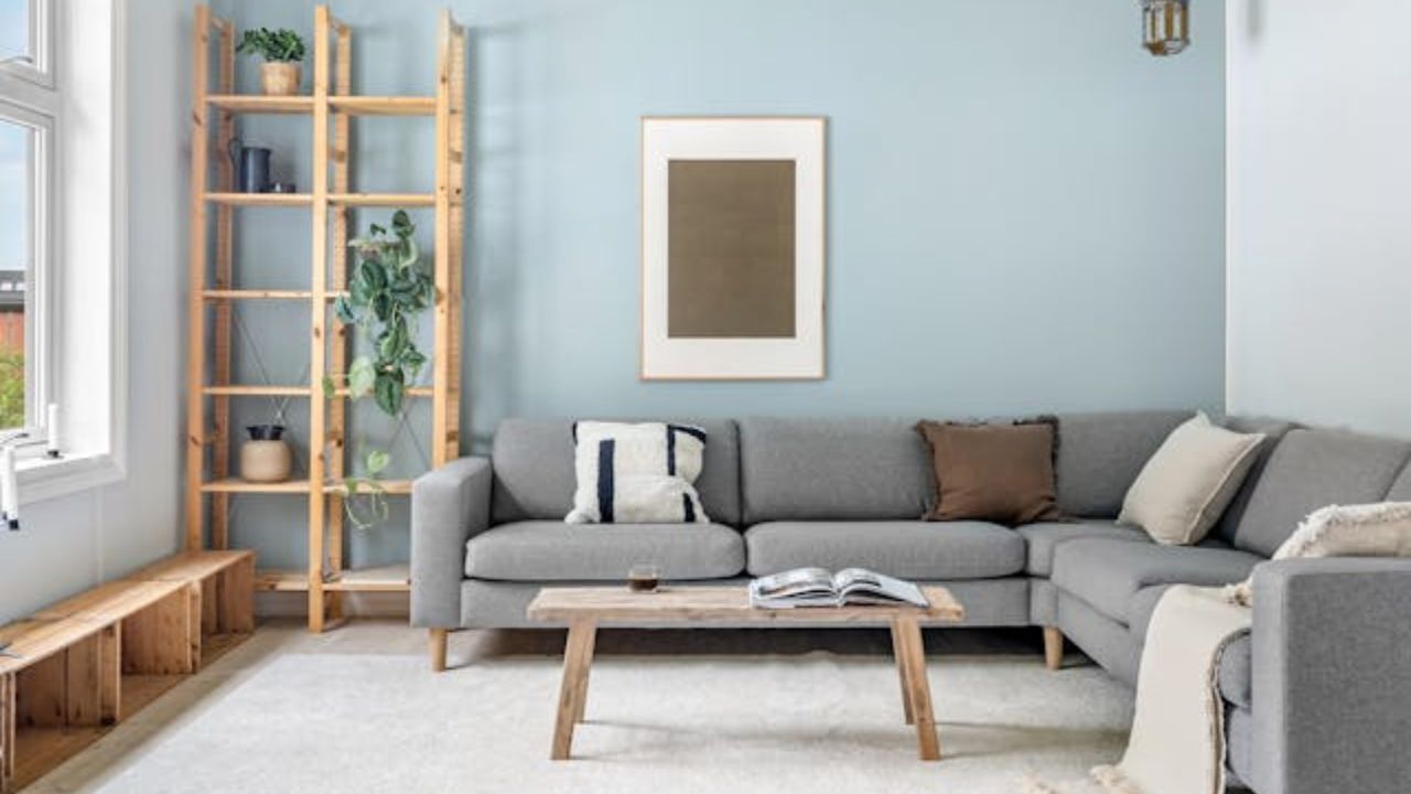
The choice of colors in a space is one of the most impactful aspects of interior design. Several studies confirm that colors influence not only the aesthetics of a space, but also the perception, mood, and even the behavior of its occupants.
According to the American Psychological Association (APA), color psychology is an essential factor in creating environments that promote well-being and functionality.
+ Is it time to say goodbye to your coffee table? Find out when to free up space in your living room
As an interior designer, I always emphasize: it’s not just about trends, but about creating atmospheres that reflect who you are and how you want to feel at home. Below, I present 5 powerful colors that can completely transform how you live and experience your home, based on studies and practical experiences.
1. Deep blue: serenity and focus
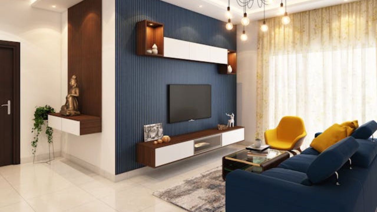
Blue is one of the most used colors in interior design precisely because of its calming effect. Deeper tones, such as petrol or navy blue, promote relaxation, reduce anxiety, and improve focus. According to a study published in the Journal of Environmental Psychology (2015), cool-toned environments tend to lower heart rate and induce states of tranquility.
How to use it:
Ideal for bedrooms, offices, and reading rooms. It can be applied to an accent wall or furniture, balanced with neutral tones and light wood.
2. Moss green: connection with nature
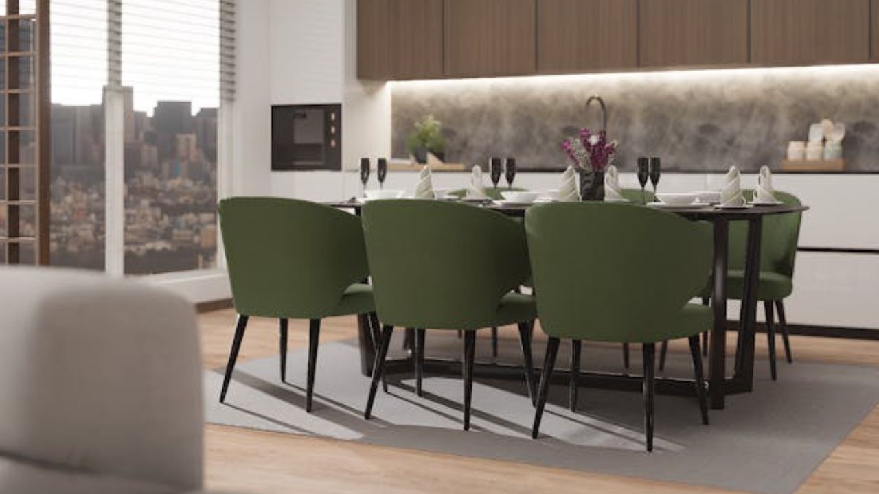
Green is associated with renewal, balance, and vitality. Moss or olive tones are on the rise, especially in biophilic design, which aims to integrate natural elements into the environment. Studies, such as one conducted by the University of Essex (2010), show that green improves mood and reduces stress levels, reinforcing the need to incorporate this tone in social spaces.
How to use it:
Perfect for living rooms and kitchens. Combine with natural fibers like linen or rattan and plenty of real greenery to maximize the positive effects.
3. Terracotta: coziness and sophistication
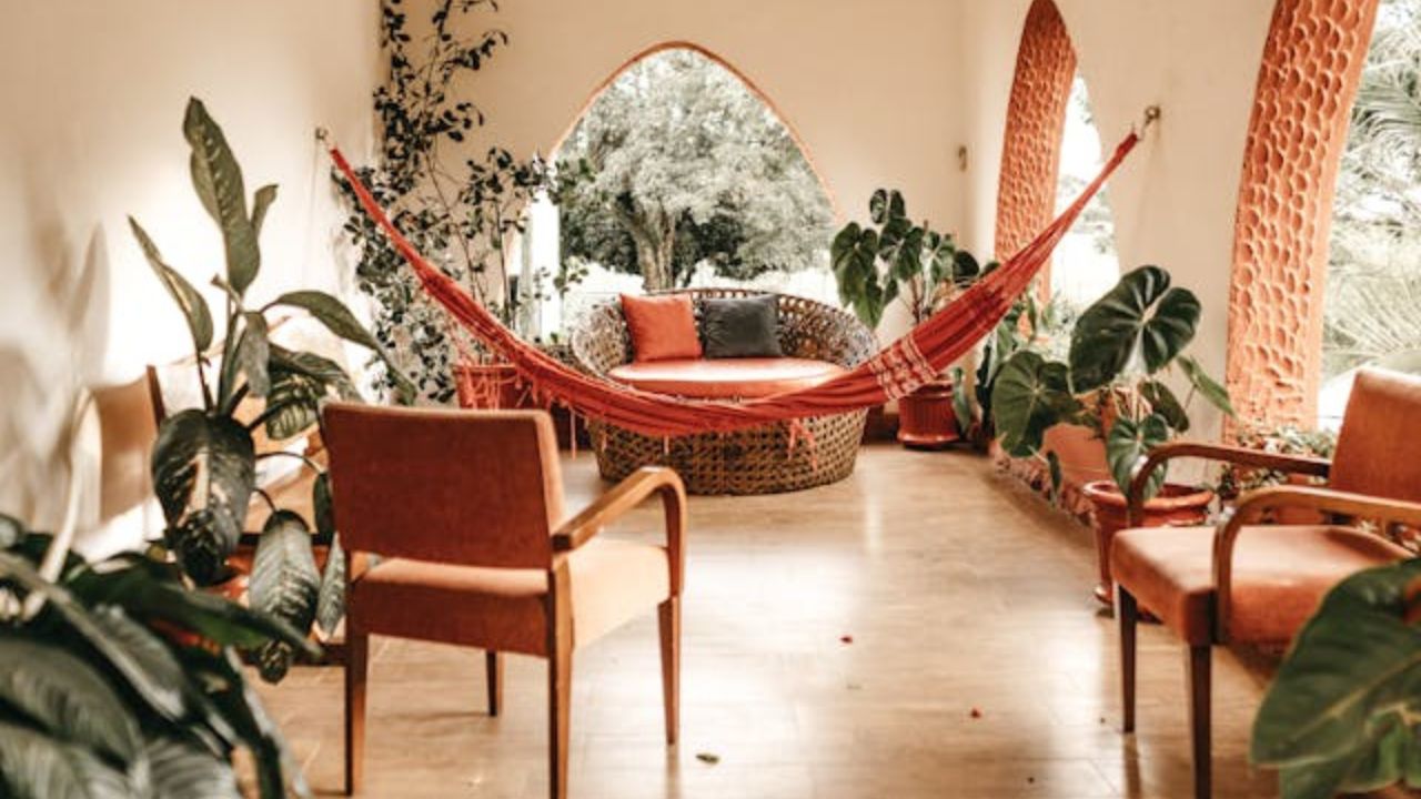
Terracotta, an earthy variation of orange, conveys warmth and comfort, creating cozy and sophisticated environments. According to the Pantone Institute, warm and earthy colors evoke safety and stability, turning the home into a true refuge. Additionally, terracotta aligns with design trends that value rusticity and authenticity.
How to use it:
Recommended for social areas like dining rooms and porches. It pairs well with aged metals and natural materials such as ceramics and dark wood.
4. Mustard yellow: energy and creativity
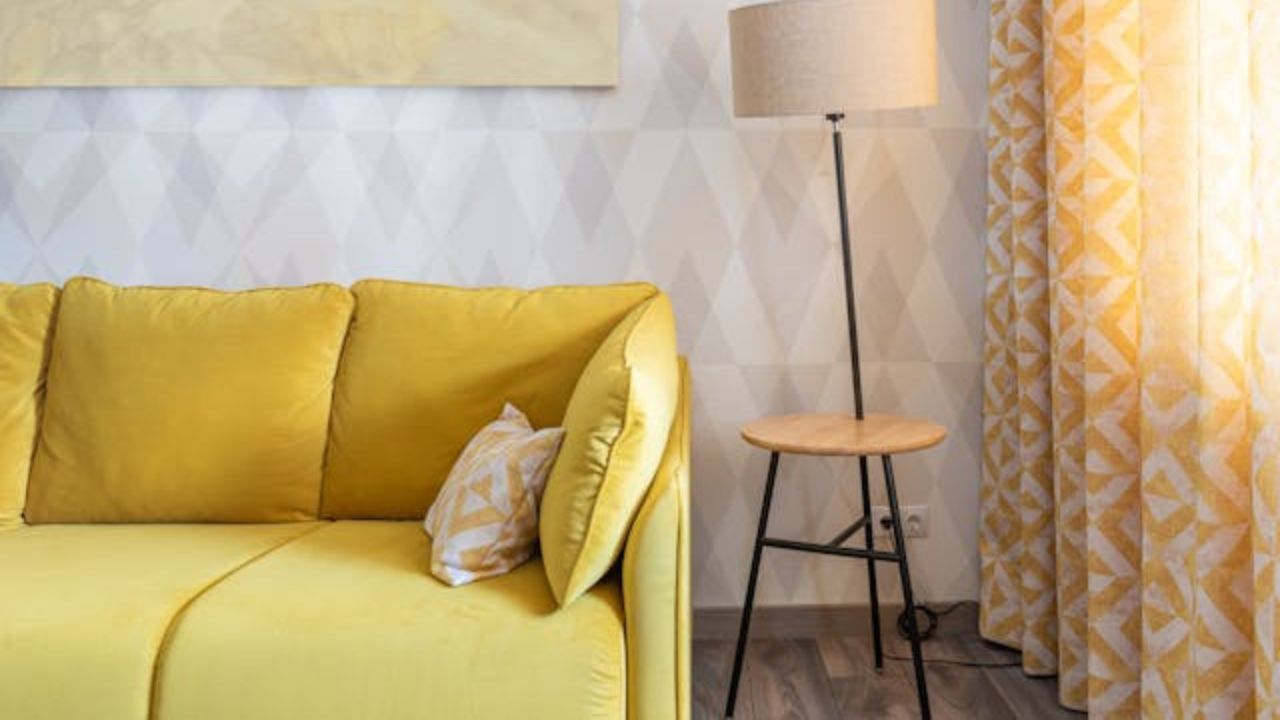
Mustard yellow injects energy without being overly vibrant. Research from Color Research & Application (2018) indicates that yellowish tones stimulate creativity and communication. Mustard, being a more muted shade, provides these benefits without causing visual fatigue.
How to use it:
Excellent for kitchens, workspaces, and creative areas. It can be added through pillows, armchairs, or even a rug for an elegant and stimulating pop of color.
5. Warm neutrals: timeless elegance
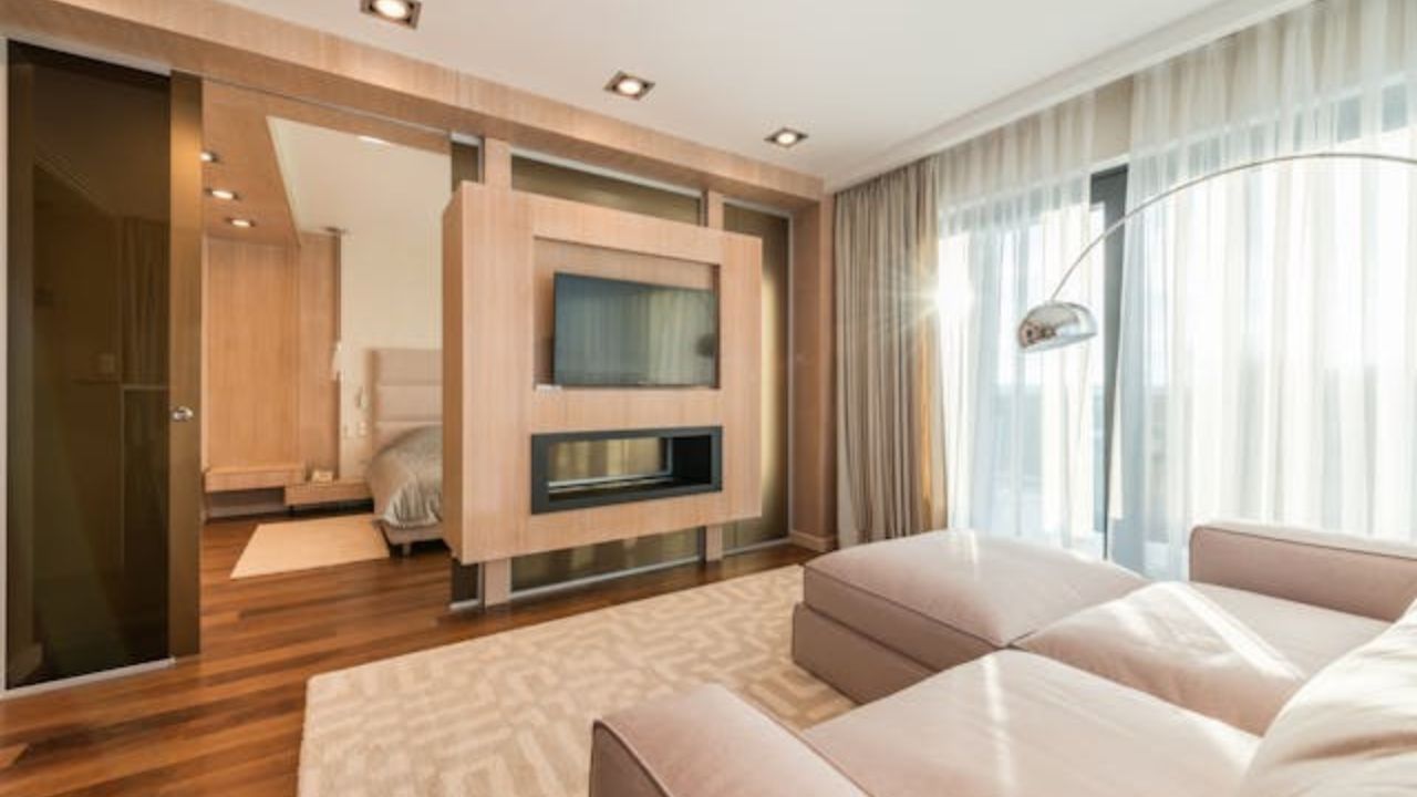
Warm neutral tones such as beige, sand, and taupe are essential foundations for any interior design project. Unlike cool grays, warm neutrals convey coziness, elegance, and versatility. The American Society of Interior Designers highlights that neutral colors are favored for creating lasting environments that adapt to changing styles.
How to use them:
Perfect for any room in the house, especially those meant for relaxation, such as living rooms and bedrooms. They can be enhanced with varied textures and wood elements.
Final considerations
Each of these colors plays a key role in creating spaces that welcome, inspire, or energize. Conscious color choices transform not just aesthetics but daily life in your home.
Remember: more than following trends, it’s important to identify what kind of atmosphere you want to create. The right color can be the key to turning your home into a space that enhances your physical and emotional well-being.
This content was created with the help of AI and reviewed by the editorial team.

