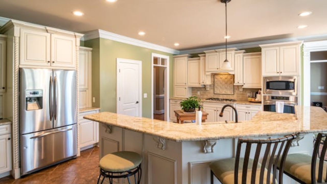
Choosing your kitchen color is one of the most important decisions in interior design — after all, it’s the heart of the home, where we cook, entertain guests, and share family moments.
+ 7 furniture trends designers can’t wait to see in 2026
However, some colors that look beautiful on a palette can become major regrets once applied to the kitchen walls, cabinets, or tiles. According to interior designers, certain shades can make the space feel smaller, tiring, or even affect how we perceive food and appetite.
Below are the 5 colors experts recommend avoiding in the kitchen — and why.
1. Bold red
Although vibrant and full of energy, red can easily become overwhelming when used over large areas. Designers explain that this color strongly stimulates the senses, which can be exhausting over time — especially in a space where you spend a lot of time. Highly saturated tones, like cherry or scarlet, tend to dominate the room and make it difficult to achieve harmony with appliances and finishes. If you want warmth, opt for more earthy versions such as terracotta.
2. All black
Black may look elegant and modern, but when overused in the kitchen, it absorbs light and makes the space feel smaller and more enclosed. It’s also a color that easily reveals dust, grease splashes, and stains, requiring constant upkeep. Designers suggest using it only as an accent — for handles, lamps, or countertops — and balancing it with lighter shades to maintain an airy atmosphere.
3. Lime green or neon tones
Bright, fluorescent colors might seem fun in theory, but in practice, they can make the space visually overwhelming. Lime green, for example, reflects a lot of light and creates an artificial feeling. Instead, designers recommend olive, moss, or sage tones, which evoke calmness and pair beautifully with natural materials like wood and stone.
4. Very dark blue
While blue is a popular choice for kitchens, darker tones — such as deep navy or petroleum blue — can make the space heavy and gloomy, especially in smaller areas or those with little natural light. Moreover, blue is known to suppress appetite, which can take away from the kitchen’s inviting atmosphere. For a sophisticated touch, choose lighter or grayish blues instead.
5. Pure white
It might sound surprising, but pure white also makes the list of potential regrets. Although it conveys cleanliness and spaciousness, all-white kitchens can feel cold and impersonal. In addition, this color easily shows dirt, stains, and wear over time. Designers prefer off-white, beige, or cream shades, which maintain brightness while adding warmth and visual comfort.
Designers’ final tip
Before repainting your kitchen, test colors under different lighting — both natural and artificial. Shades change depending on light, and what looks beautiful in the morning might appear dull at night. Also, consider how the color interacts with your countertops, backsplash, and cabinetry.
The ideal kitchen strikes a balance between beauty and functionality, and color plays a key role in achieving that harmony. In 2026, the focus is on natural, soft, and warm tones that make the space more inviting, practical, and timeless.
This content was created with the help of AI and reviewed by the editorial team.

